Unless you’re reading this via RSS or email, you’ll see that things look a wee mite different on the Stew today! Last night, John Arcadian finished the final tweaks and testing and made our new site design live.
John designed and coded the new look and functionality, working with graphic designer Lauren Chaikin and artist Andrew McIntosh (who also did the cover and some of the interior art in our first book, Eureka) to nail all the details.
This bolder, brighter design puts content front and center, widening the main column where articles appear (and making it easier to scan the front page), and also makes a host of changes that should make the site easier for you to use. Most of what used to be in the sidebar has been pushed to top menus, for example, making the things readers use the most more prominent while keeping the other stuff available.
It also incorporates more graphics, including comment icons, category images, and a surprise for folks with widescreen monitors (which is worth seeking out even if you usually view the Stew on a smaller screen). Gnome Stew has a lot of personality, and I think that really shows in this new design.
For posterity, here’s the previous design (make it huge):
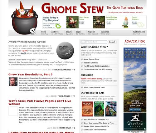
This is Gnome Stew’s third design since our launch in 2008. The previous site design went live on April 20, 2009, and was created and implemented by Darren Hardy — who has also done the layout and design for all three of our books. (In that post you can even see a screenshot of my original design, a modified version of Grid Focus by Derek Punksalan.)
We loved the old design, but it was time for a change. We hope you like the new look, feel, and functionality of the site. Like everything we do here, our main goal in redesigning the site was to help you, our readers.
Thank you!
A big thank you to John, Lauren, and Andrew for their hard work on the new site — you rock! I’d also like to say thank you to our readers for supporting the Stew over the past four years. The ads you view and click on, and the stuff you buy using the Support links under the sidebar, enables us to pay for hosting (over $400/year), give out cool prizes, and fund efforts like this. Thank you!
Last but not least, if you have feedback on the new design, or find a bug we missed, please tell us in the comments!



I love the new look! Mad props to John, Lauren, and Andrew – you did a great job!
Oh, and the surprise for widescreen users? Nice! 😉
I am loving all these gnew little gnicons littered about the site. I assume they’re Andrew’s work? Or are they Lauren’s?
All of the new artwork on the site was created by Andrew.
Congrats on the new theme, Gnomes! Love the brightness and roominess. Grats on your ENnie nods too. Good luck in the voting!
What kind of meat is the comment hatchet whacking into?
Rumors that it’s succulent dwarf meat are entirely unfounded.
Johnn> Steak, surely steak. Not gnome, and certainly not halfling at all.
My only complain is that my laptop isn’t widescreen so I have to zoom out to see the gnomes on the side. But who cares, the new design is bright. It feels a lot more ordered, clearly defined boarders. I love it.
John came up with the gnomes as a fun Easter egg that also does double duty by giving folks with widescreen monitors something to fill all that white space. Readers without widescreen monitors aren’t missing any functionality, just those two pieces of artwork.
looks great, very bloody.
I really, really like the update. That’s how I know that I’m not a graphic designer at all–I just didn’t notice the constraints before, but now they’re completely clear. Well done!
Amen to that! John and Lauren came up with fixes and approaches to different elements of the site that never would have occurred to me.
I still can’t see the pictures in my Google Reader feed on my phone. This is the only site that I have that problem.
Hey Roger,
I thought I’d gotten the bugs out of the feed a few months back. Is it just the standard Google Reader app through the android store?
The next step is to implement our mobile site coding. It’s been about half finished for a while, I’ve just been waiting to get the new site done to finish it up and style it. So you should see a lot more mobile functionality roll out in the next few days.
John, I don’t use the Reader app because I found I prefer the UI of the regular internet ‘Browser’ app better. Hopefully I can start seeing those pictures soon. Thanks!
As soon as you can see them again, I’ll implement a snippet of code that makes them all pictures of me in just my gnome hat.
XOXO
@Roger – Well, I believe you will be able to see images now. I’ve been poking around with it, and while I’d previously fixed 4 or 5 different issues with images displaying, google reader slipped through our hotlink image protection. Other google URLs were in there, but apparently google reader needs it’s own setting. I just tried it on my phone with the google reader web ui and they came through. Let me know if that is the case for you.
The new site looks great!
The new site looks really
great!
I am feeling it a few “heavy” in load time, but it almost imperceptible.
I like the new look. At first I wasn’t sure, but that was probably just me being resistant to change. The gnomes should update their profiles though. For example, it has been quite some time since Scott was running Primetime Adventures for the Hanford group, etc. etc. 🙂
We are woefully behind in our main bios, aren’t we?
Yes indeed! Right now, it’s like a stew that gets put in the tupperware but somehow left in the back corner of the fridge for a year or two. Nothing worse than two-year old stew ’cause not even tupperware can save THAT! Or yeah…. an update would be cool. 😀
I hate to be the lone voice in the crowd, but the more I look at it the less I like it. The previous one looked more professional; this one looks cartoony.
because gaming is such a sooooper-serious endeavour? 🙂
We try not to take ourselves too seriously. 😉
It does indeed look good on the screen. However, I like to print out many of your articles for future reference/reading on the bus, and trying to print with the new layout is a nightmare. 🙁 Any chance of including a “print friendly” version of the individual article pages?
This is a really good idea, and I didn’t know folks were doing this with our articles. I’ve emailed John, our technical admin, about it. I know I’ve seen printer friendly and “make this a PDF” buttons on other blogs, so perhaps we can implement something similar and help you out. Stay tuned!
You should see a nice little Print Friendly link at the top of all posts and pages. That will give you a printer (and ink) friendly version of the article. Some styling in the articles might be lost, but it will give you something that works well on dead
gnome skintree.Thank you SO MUCH! This is even better for printing than your previous design!
Happy to be of service. Being able to update things and respond to feedback is one of the things I like most about web-coding. The media is so alive and moldable. You can improve upon it if you find something that makes it better.